5 ways to design beautiful converting email newsletters
Written by Maria Fintanidou | 22nd May 2024
Email newsletters aren’t just about reaching your subscribers’ inboxes. They’re about building trust and keeping your brand at the forefront of your recipients’ minds. And the best way to do that is by designing beautiful email newsletters.
The average recipient receives a ton of daily emails. So, making your newsletters stand out is the first step towards email marketing success . In this article, we’ll show you how to design beautiful email newsletters that people open, read, and remember.
Pick a visually appealing template
It all starts with an email template. The reason why email templates work is that they save you time and effort. So, they’re a great choice for entry-level marketers, small teams,, or savvy marketers with a lot on their plate. With attractive newsletter templates, everyone can design beautiful email newsletters in a few clicks. And that’s even if they don’t have coding skills or a graphic designer to do the job.
Email newsletter templates provide a structure for your email layout. It’s up to you to customize their design and build on them to create high-converting emails.
How is that possible? Using a reputable email template builder that offers a selection of templates for every business need, campaign goal, and industry type. Let’s imagine you’re planning a new product launch. In this scenario, you should pick a template that combines text with images to showcase the product’s different uses.
Email template creators also offer the foundation to get your creative juices flowing. You can add elements like images, buttons, social media icons, etc. Experiment with adding white space, tweaking the fonts, and adjusting the colors to fit your brand color palette. Anything goes as long as it matches your brand identity and serves your campaign objectives.
One of the best advantages of ready-made templates is that they’re already optimized based on best practices in email design. You have engaging visuals, web-friendly fonts, strategically placed CTAs, and responsive designs so users can enjoy your email content on every device. Great starting point, right?
Use fonts and colors wisely
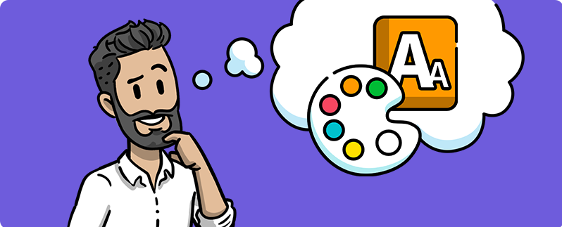
One of the first considerations when designing email newsletters is the choice of colors and fonts. Picking the right color and font ensures your email content is accessible to every reader. By creating readable email content, you communicate your message more effectively, which, in turn, sends more traffic to your product pages, blog, or landing pages .
To provide the best reading experience, you need to use a color palette with sufficient contrast between your text and background. This design principle helps you increase your email’s visual appeal and readability. Using contrasting colors reduces eye strain by making the text stand out.
Keep in mind that low-contrast color schemes make it hard for people with vision impairments to read your email. It’s wise to leverage a dedicated tool to find colors that work well together or contrast each other adequately.
Similarly, picking proper fonts affects the look and feel of your emails. They help you emphasize the most important information and establish a visual hierarchy. Here are a few tips to consider when looking for the right email fonts:
- Typically, the ideal font size to ensure legibility is within 12-16 px for the email body, while the headlines should be between 18-22 px.
- Opt for clear and legible fonts for a consistent look across devices and email clients. Some of the most popular web-safe fonts are Arial, Georgia, Helvetica, Verdana, and Times New Roman. Avoid complex and decorative fonts because they can be challenging to read.
- Consider using different font sizes to create a visual hierarchy. That’s how readers will pull out the most important information once they open your email. Don’t overdo it, though. Using too many sizes leads to a cluttered email design.

Add some visual storytelling
Incorporating visual storytelling into your newsletters enhances recipient engagement. With visual elements like images, infographics, and videos, you’ll grab attention, break down complex concepts, and help readers retain information more effectively. But when you combine those elements with a story, you’ll leave a lasting impression on your audience.
You can start by including pictures of satisfied customers interacting with your product or service. That way, you evoke emotions while demonstrating real-life scenarios showing how you addressed consumers’ pain points.
Infographics can be effective in presenting data in a digestible format. Additionally, short videos might highlight your brand’s story or showcase behind-the-scenes footage. This is an excellent method for your audience to relate to your brand.
Another powerful visual storytelling technique is including explainer videos in your emails. Explainer videos are a great tool for simplifying ideas and demonstrating products. Are you planning to launch a new feature? Consider introducing it with a brief video walkthrough. You can include a snippet of your video in your newsletter and use an actionable CTA to encourage recipients to watch the full video. That way, you entertain your audience and help them understand how to get maximum value from your products or services.
Keep your layout clean
A simple and clean layout minimizes distractions for your recipients, helping them grasp core messages easily. If you incorporate different content types, use enough white space to define sections clearly. Breaking up your text through bullet points and subheadings makes your content scannable and aesthetically pleasing. And since readers don’t usually read the entire email, place your key message first so they don’t miss crucial information.
Invest in a mobile-friendly email design and avoid multi-column design since it compromises the reading experience for users with small screens. For the same reason, you should divide your content into short blocks of text. Otherwise, it will be displayed in a single-column layout, making mobile users scroll forever to read the entire email.
Last but not least, make sure your email design aligns with your newsletter objective. For instance, if you want to display a range of products, you should use a clean and minimalist layout with brief descriptions under each item. Excessive text and too many graphics will just clutter your email and frustrate subscribers on what matters most: acting on your message.
Build CTAs strategically
Which brings us to the million-dollar question: How will you urge recipients to take action through your newsletter? The answer lies in your email CTA. Your CTA shows recipients what you expect them to do next. So, instead of having them wondering about what to do, show them as clearly as possible. When planning your CTA, you should adopt the following tactics:
- Place your primary CTA above the fold so readers can see it once they open your newsletter without scrolling. That way, your email primarily focuseswill primarily on the content featured there.
- Use clear, concise, and action-oriented language to describe the action you need recipients to take. Some examples may include: “Learn More,” “Buy Now,” “Register Today,” etc.
- Opt for button CTAs instead of text links to grab attention instantly. You can design them to stand out with compelling text and contrasting colors. Plus, button CTAs are mobile-friendly as they are more clickable on touchscreens.
- Make your CTAs prominent using bold or different colors and eye-catching fonts. Also, leave enough white space around your CTAs so they stand out from the rest of the email content.
- A/B test your CTAs by experimenting with different wording, placement, and design. This process helps you decide which is most effective in increasing conversions.
- Animated CTAs are a dynamic way to encourage interaction. Not to mention that animation allows for more creativity. Optimize them for mobile and avoid overload as too much movement gets overwhelming.
Achieve your goals with compelling email newsletters
Designing beautiful email newsletters is all about making smart design choices. Focus on the right template, use proper fonts and colors, and incorporate visual storytelling elements to create outstanding newsletters. Also, keeping your layout clean and adding effective CTAs helps you drive engagement.
As you move forward with your email newsletter design, remember that each email element should deliver your message and encourage actions from your recipients. So, follow the critical strategies mentioned, be creative, and refine your newsletter design to create high-converting email marketing campaigns .

Visual Messaging: 3 Pro Tips for High-Impact Communication
Want to learn how to use visuals to make your communications more impactful? Join our upcoming webinar on June 6 at 12pm EST | 5pm GMT where simpleshow experts will share expert tips and insights on how adding just a few visuals can take your messaging to the next level.
Date: June 6, 2024
Time: 12 PM ET
Don’t miss out—register now!
Author's bio

Maria Fintanidou works as a copywriter for email marketing automation software Moosend, having created the Help Articles (FAQs) and overseen the platform’s translations in Greek and Spanish. She loves exploring new cultures and ways of thinking through traveling, reading, and language learning.
